| |

Neutral
|
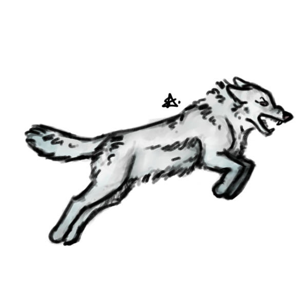
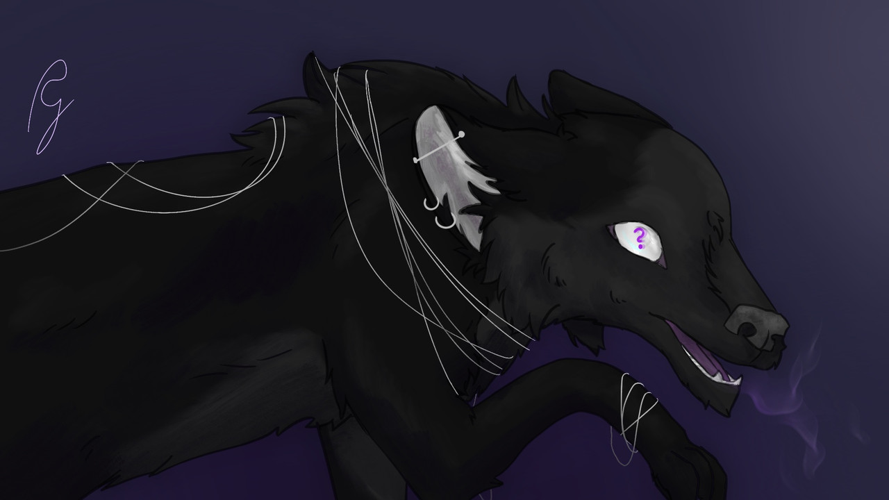
Hi! I'd love to get a redline with some advice on these this piece: 
Art made by me, character belongs to solas. It was my first time trying out both a growl and a jumping pose, so it was a big experiment :') I think I can already spot some issues myself, but I'd appreciate an outside perspective. |
|
|
| |

Neutral
|
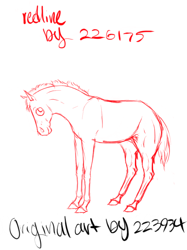
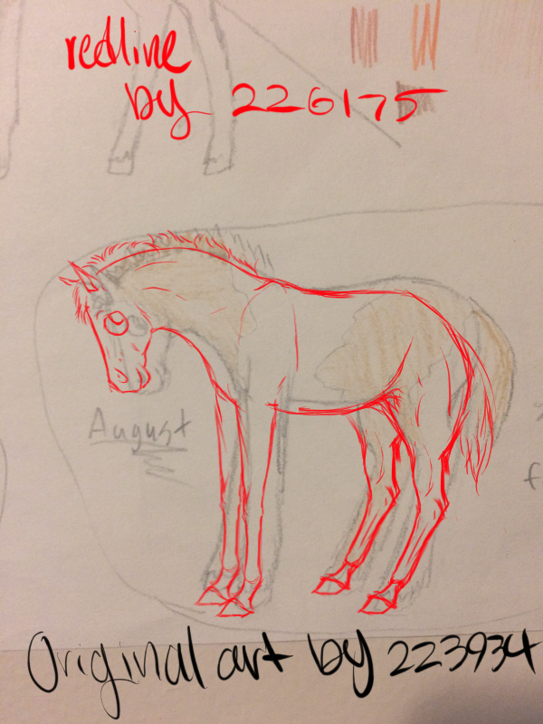
Shadow . First piece! . Redline:   Actually, I don't have too much to say! I feel that your style, rather cartoony as it was, shouldn't be judged for realistic anatomy. That face is adorable, let's be honest lmao. I would change a thing about her face, except for adding some definition to the muzzle ^^ Showing the inner ear is always good as well! For the mane, I think it's best to go with light quick strokes, to replicate the hair. It shouldn't be spiky or clump, and depth is added when it falls in different directions. Generally the same comment for the tail. I made some edits on the legs - narrowing them, and separate it the forearm from the canon bone more. It's difficult to get the joint right - it's not round, really, but slightly flatter in the front, and sharper in the back? I'll go more into depth about that on your next piece. Same thing for the hind legs - also, make sure to drop the hock a bit further down on the leg! Finally, the hindquarters should be quite so round - the slope is gradual. Because of the adorable cartoon sort of style, I'm not gonna dive in to anatomy. No worries, I'll get into it on your second piece, when I get around to redlining ^^ |
|
|
| |

Neutral
|
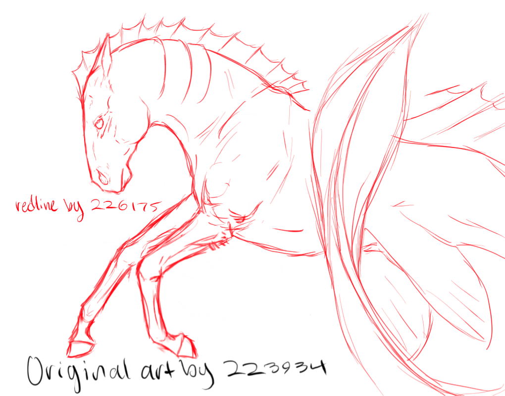
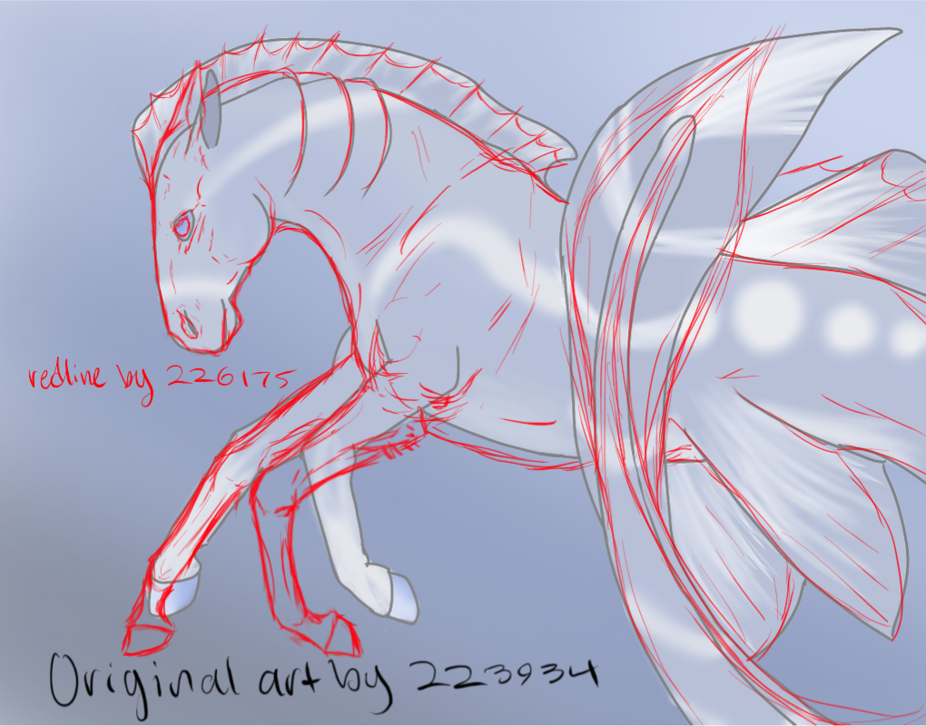
Shadow . Second piece! . Redline:   First of all, I love the concept and design! Very creative, and it looks great! For the mane/fin, I did change the style a bit, but I think it looks good with the way you did it as well!
First off, the muzzle: It's not rounded. It dips inwards a bit at the nostril, flattens, and then extends out about near the mouth. For the lower lip, it's slightly more triangular than round, although it does vary from horse to horse.
The ear should probably be a little more forward on the head, though maybe not quite so far as I put it aha. As for the eye: eyes are tough, there's no doubt about it. Flatter in the top, where the skin above the eye is, then more rounded on the bottom. It takes a while to get, and I'm certainly not there yet either! Tons of references is always good ^^
I think you did a good job on the neck, but just make sure the throat moves into the head more fluidly! I also lowered the whither a bit, just so the back and neck are more aligned. I dropped the belly a bit, to make the character look more balanced, just so the chest moved into the stomach better. I lowered the elbow a bit, just so it's not so far up into the body. The lowered elbow on a horse allows for much better mobility. I made the forearm a bit more tapered, wider at the elbow and narrower at the joint. The legs should be a bit longer - on a well balanced horse, the forearm is the same length or longer than the canon bone.
For the hoof, make sure the pastern is defined! The pastern connects the cannon bone to the hoof, and is easy to forget about, but important. Everything else looks good, I think! Well done overall! Horses have wack anatomy aha. The character concept is awesome ^^ |
|
|
| |

Neutral
|
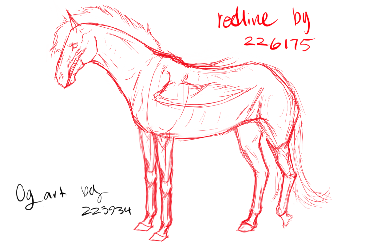
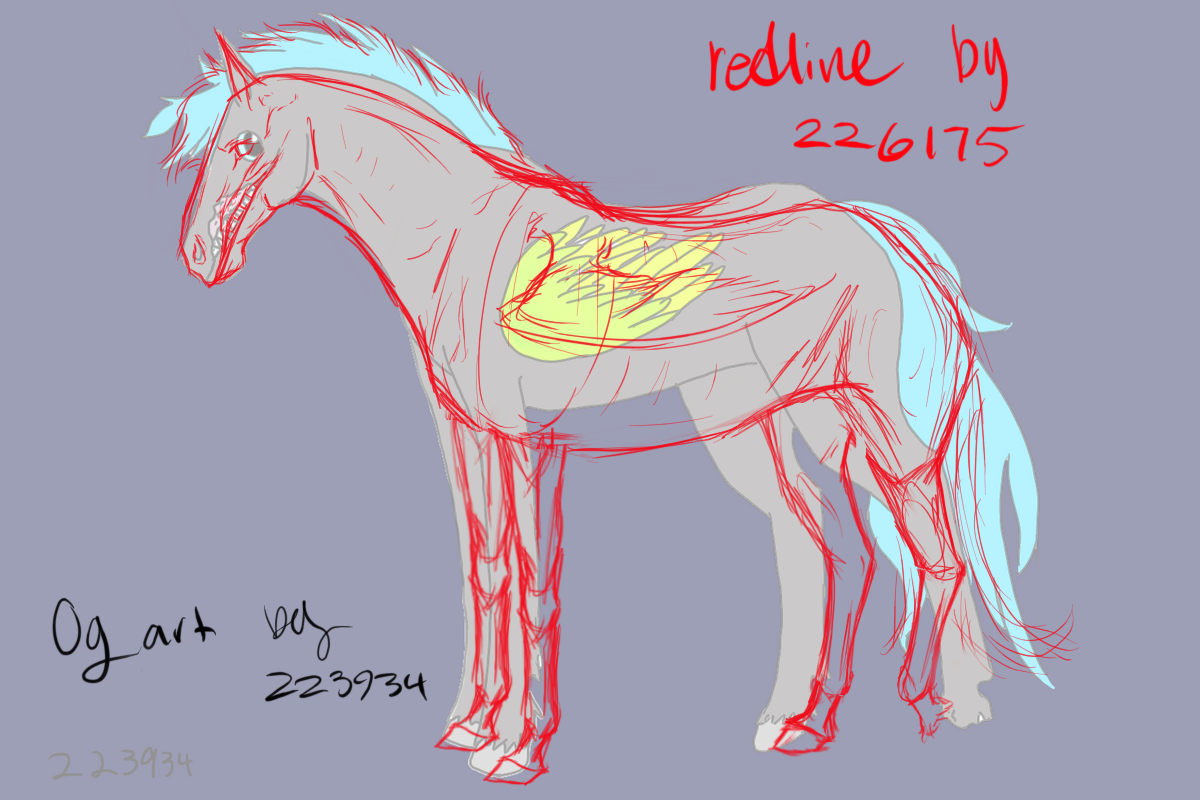
Shadow . Third piece! . Redline:   I feel I covered a lot about the head, eyes, and forelegs in the your second piece, so I'll only lightly touch on that kind of thing. Isn't this the young version of Lynx, your 700 some year old man? ^^ Make sure his withers are a little further down! The back can still be a bit swayed, if that's what you're looking for, even with lower withers. I dropped is belly, as in the second piece, for realism purposes. Horses are not quite that thin. I also lengthened him a bit. For the hind legs, I separate them into three parts: where the hindquarters meet the legs - a sort of triangle shape - then the gaskin, a generally elongated oval sort of shape. Then, the canon bone again - really, just parallel lines. As for the joints, the hock is pretty triangular, whereas the fetlock is more rounded. Don't forget the pastern, in between the fetlock and the hoof! ^^
I don't know how a horse with a missing horse might carry his leg aha, so I just made him cock his leg a bit, as though he was carrying it above ground. Yup, his mane isn't the realistic, so he kinda has a mohawk aha As for the wing, I made sure that the part of the wing that meets the shoulder is visible, just so I doesn't look like it's floating. Anyway, well done! He's such a lovely character ^^ |
|
|
| |
Darkseeker
|
I'd love some tips on this <3 Both writing and redlining would be nice ~ (c) to me)  |
|
|
| |

Darkseeker
|
Ahhh! Thank you, they all look so good and the pointers are so helpful! And yes, thats Lynx before he grew ancient XD |
|
|
| |

Neutral
|
Shadow, I'm so glad I could help!! ^^
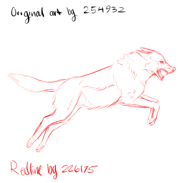
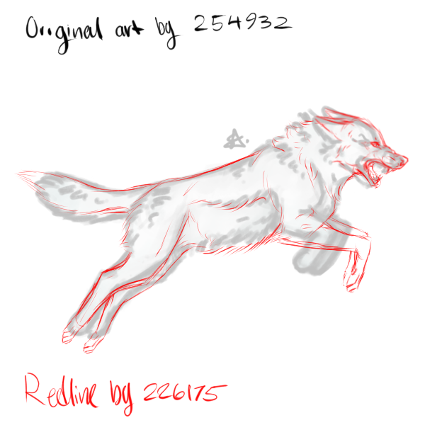
. clementine . Redline: 

First of all, I'd like to state that this is far from my best work :') I'm struggling a bit with an art block, and so I'm sorry in advance for poor quality of the redlines and critiques. Sorry! But I'll give it my best go.
I really don't have too much to say! Your style isn't completely realistic, and so, in a more semi-realistic context, I think it looks perfect! I love your use of the thick lines - your work really is lovely. So, paws: You really don't draw them in, which I think is fine considering that's your style, and it looks good. I drew them in anyways, but whether that's something you want to incorporate in future pieces is up to you! On to the legs! I don't see any issues with the hind legs, but the forelegs do need to be lengthened. It's important to note that the upper leg is always longer than the lower leg. The back, stomach, and chest looks good! I drew the stomach further down near the chest so the body looks more fluid. The head looks good! I wouldn't extend the mouth quite so far into the head, and make sure the end of the mouth doesn't close in a triangular shape, but a more rounded one. The neck may need to be longer, as the wolf is extended into a jump. The legs are likely not going to be exactly parallel, and will have some position variation. As for the facial expression, well done for a first attempt! Try studying some snarling canine references on the internet for extra help. I love your style, did I already mention that a hundred times? :) Overall, good job! |
|
|
| |

Darkseeker
|
Wow! I sont have art to show because im selfconsious xd. But i just wanted to say your advice is really neat and detailed:), i learned just from reading your comments on the others artists work! |
|
|
| |

Neutral
|
Oh, thank you! That means a lot to me ^^ |
|
|
| |

Neutral
|
Boundless - All of your advice makes a lot of sense! I usually do include some detail for the paws, but I was really struggling with the legs on this one, so I thought it would be better to leave it at that :') Thank you for helping me out! And your art is literally so much better than mine, you're really giving me too much credit... I don't even know what's going on with my style, lmao- |
|
|
